For the CSE 440: Intro to Human-Computer Interaction course, we were to design an app for a change (transform your or your family’s behavior), crowd sourced mobile AI (e.g., use Mechanical Turk to give perfect vision, speech reco, etc. – design two UIs: one for end users and one for workers), or creativity (help people be more creative in their everyday lives).
I was the project manager and did documentation. I took a similar course already, so I did provide some of the UX insights to my fellow computer science major teammates.
Our topic: Many people assume that driving is the only way to get into the outdoors to do things like hiking, cycling, or camping. Books and websites with information on hiking and camping trips generally assume one has access to a motor vehicle. But driving is not an option for many people and even for those who do have cars, driving is not always ideal because gas and parking are expensive.
We propose a mobile application that enables outdoor enthusiasts to:
Complete documentation on the project, which includes presentations held in class, are on the Bus Stop to Mountain Top project website.
We observed 3 people for our contextual inquiries. All of them were college students from the Seattle area. Each were planning an outdoor destination in different ways. Based on what we learned about them, we came up with the tasks that were to be supported by our application.
| Task Level | Task | Frequency (high, med, low) | Importance (high, med, low) |
|---|---|---|---|
| Simple | Sharing Directions | Med | Low |
| Moderate | Getting Directions | High | High |
| Complex | Selecting Destination | High | High |
After some sketches and feedback from our TA, we did come up with a low-fi prototype made of paper. Below are the main screens of the prototype.
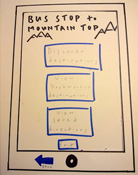 Opening screen to have user select finding a destination or find saved searches
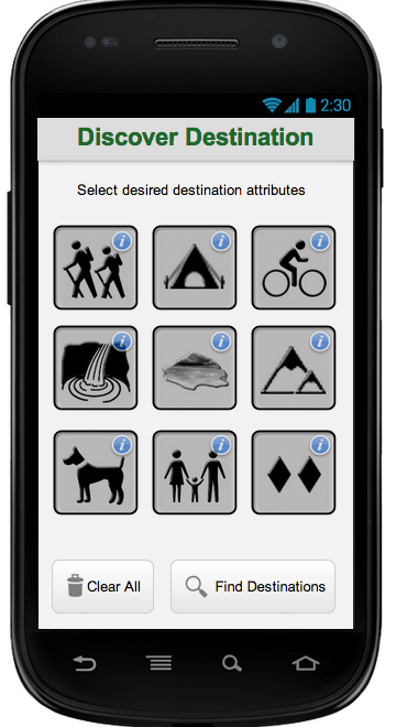
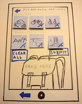 Selecting and adding destination attributes
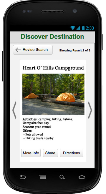
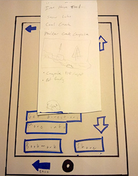 Results of the selected attributes
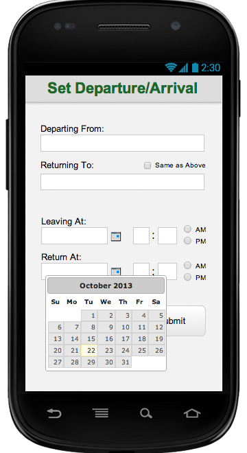
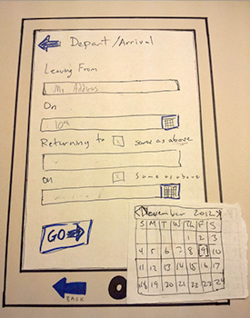 Input for departure and arrival of the trip
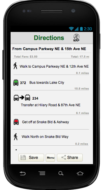
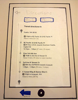 Directions to their trip destination
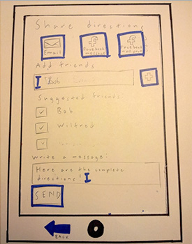 Screen where a user can send directions to others
We selected three participants who were all UW students and outdoor enthusiasts. Two of the participants did not own cars. They were selected because they took a class through the Experimental College on hiking by bus. They had considerable experience going hiking and camping. The third was selected through mutual friends on Facebook. He had a car in the past, but did not at the time of the interview. He also had a lot of outdoor experience and does a wide range of outdoor activities including kayaking and skiing.
Each person had a role for the testing. I facilitated one of the testing sessions while the others were note takers/observers and one acted as the application, switching screens based on the user's input.
After testing and further feedback from our TAs, we refined our prototype. Our major changes were removing the first landing page so that the user would go straight to selecting their trip attributes, attributes being selected by checkboxes rather than the drag and drop approach (many users did not understand this during our usability testing), and the generated search results to have horizontal swipe between site because the gesture were not as intuitive as we thought.
Using Justinmind's Prototyper Pro, we created an interactive prototype of our app. You can try the demo.
