I was placed into this redesign project for 3 months. I was hired temporarily to jump start a new website for the University of Washington's Decision Support website. During that time, I sat through interviews, created personas, and prototyped what the website could be. I ended up with a high fidelity prototype using UW Marketing's Wordpress theme as a framework. Unfortunately, the project was placed on hold, but I left documentation for when they need to look back on what has been done and what to do next.
View the UW Decision Support website I worked on.
The current website is outdated with content on pages being very long as the width for the page was 670px. Navigation was confusing as some pages jumped to different places on the navigation menu. When I first visited the website, I did not fully understand the concept of decision support or what an enterprise data warehouse is. It was also not easy to fnd what is being offered to users.
While I was there, the new tools that the team has developed is now advertised on the main page and other related pages. That, however, does not solve all the issues on the website.
Interviews were conducted with users of the Enterprise Data Warehouse from the School of Public Health, Information School, and the Foster School of Business. We learned the various types of users within the school and a bit about their workflow.
Based on the interview notes, I created personas and scenarios for the website. The personas would interact with the website, which it would facilitate information about the EDW and other business intelligence tools.
Questions to be answered:
To view the persona work, click here
I researched similar websites to see what other websites have done and to get a feel what the new website should look and feel. I came across Tableau, the Information School, salesforce.com, and the Microsoft Business Intelligence site.
I took notes on how they had their navigation set up, how image heavy their pages were, and how content was laid out.
Based on the related work research, I sketched on different ideas on how the website could look and the design flow. I also worked on the taxonomy of the pages; how the content could be reorganized with the new layout.
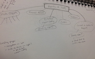
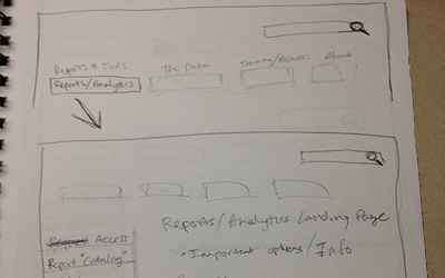
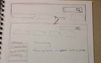
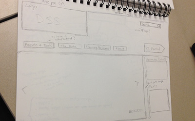
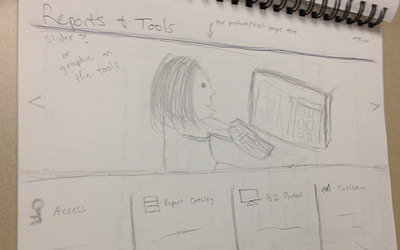
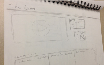
I used Axure to create an interactive prototype. It was made to mostly show how the website would flow and work. I presented the prototype and was given the opportunity to create a prototype with actual code. The Axure prototype is viewable too.
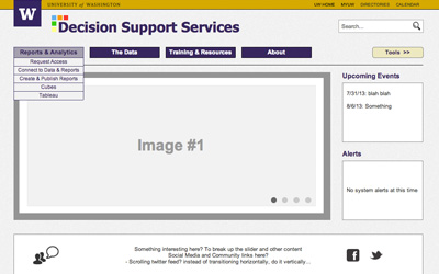
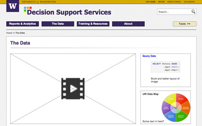
Using the Axure prototype and a mockup made by a team member, I created a high fidelty prototype with HTML, CSS, and Javascript. Following the University of Washington branding guide, I made sure to have the mandated patch and band. The website is responsive (although, was having trouble with browswer compatiblity), but I did not work on accessbility. The UW Marketing's Wordpress theme was used as a framework, with mostly the CSS being used.
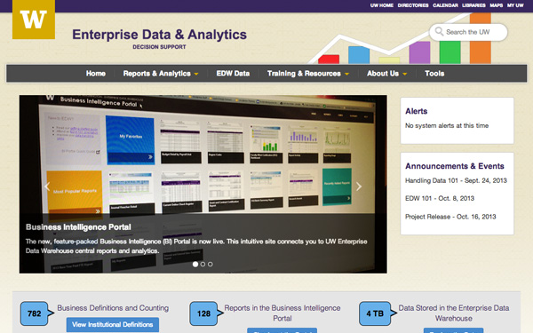
The next steps I suggested were to do A/B testing to see whether the new website is effective. That could help gain user feedback about whether the website did facilitate the information they needed, and other criticism about the website.